A horizontal ‘ruler’ for responsive design
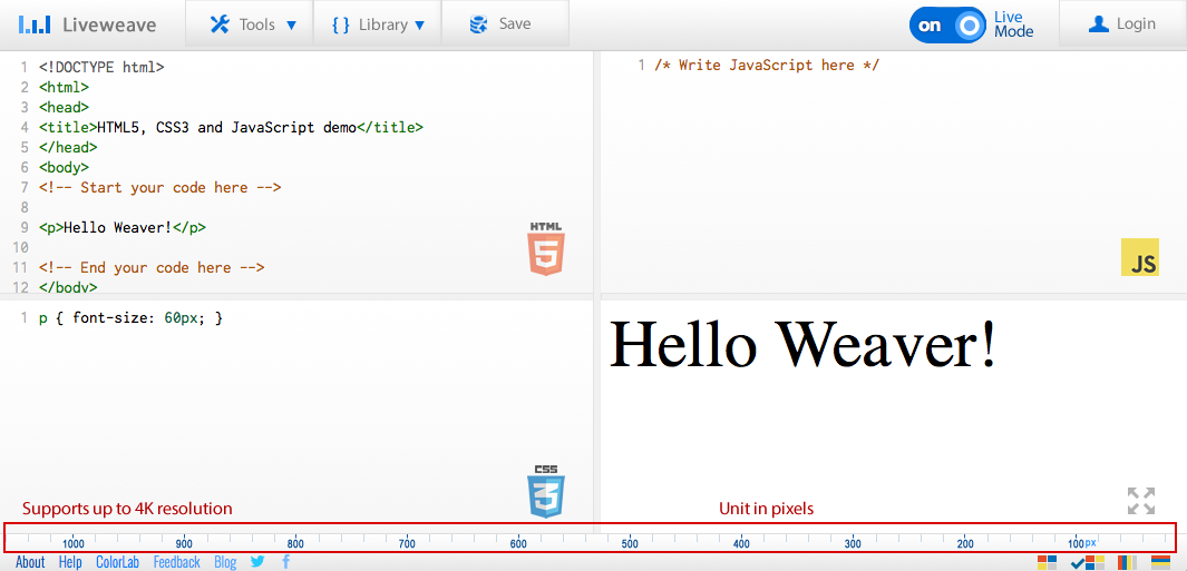
We have recently introduced a new horizontal ruler! The purpose for the ruler is mostly to help you create and test responsive designs, although it can also be used for various other features as well. You can easily change the size of the preview area and see how your weave renders accordingly.
The best part? The ruler size supports up to a 4K resolution (i.e. 3840 px horizontally)! Yep, that’s right. You can make use of the ruler even if you are building something for a 4k monitor.